Hello everyone!

My name is Chris Suhre and I’m an amateur hobbyist/painter. This will hopefully be the first in a
long series of blog post on various miniature/hobby topics.
(I hope so to! - J)
I thought I’d start off by discussing composition in competitive painting. Hopefully it’s no big surprise that to do well in painting competitions you must have a great grasp of color theory, lighting effects, and painting techniques like blending and such. But having well composed settings can also help you present a much more pleasing ensemble to your viewer.
Have you ever noticed that certain dioramas keep your eye traveling around while others seem scattered? This is due to composition of the setting. This blog post will help discuss some of the elements of composition and how we can use them to reinforce the feeling we want to invoke in our viewer. Composition is not just in miniature painting though. It can also be seen in other art forms as well such as movies and classical painting.
But before we really get started I just wanted to note a few excellent resources for composition. Many of the ideas I will discuss are thanks to these resources. The Rise of Fantasy is an excellent book by Juan Barrena that discusses many of the points I will make in this blog post.
Another great book resource is Modeling Stories in Miniatures by Antonio Fernandez Lizaso. Also, while preparing this article I came across The Art of Composition 140 Iconic shots on Facebook. We will be looking at a few of these iconic scenes in this post. Finally, the online site
Massive Voodoo is a library of useful information for any painter/hobbyist.
So, the first area to address is forced composition vs natural composition. In forced composition, we are often lining our model up with the scenery around them in parallel lines. This gives a forced or artificial feel to the piece. This is often what we see in family photos. Everyone is lined up and placed in front of scenery or behind it but not actually interacting with it. Forced composition can work on a display piece but you should realize it will give you a more photographed/posed effect. Natural composition is when there is a lack of parallel lines in a piece. This is more often what we see in dioramas where there is a battle. That doesn’t mean there can’t be good composition within the piece yet. Just that warriors on opposite sides of the battlefield shouldn’t be directly lined up against one another.
This is the Devil Shadow Mutineer’s by the incredibly talented Kat Martin. This is an example of forced composition. Notice how it almost seems like the crew members came out of the bar and then posed for a picture. They are arranged with a back drop that fits the models and scene but they really aren’t interacting with it. Note the parallel lines within the piece. The miniatures backs line up in parallel lines to the bar wall behind them.


Next is balance. In general, we want the final symmetry in a piece to be balanced. What this means is that when the piece is divided in half vertically it should appear to have the same “weight” on both sides. Now this can often be done simply by making sure the same number of items are present on each side. For instance, having a 5 man unit of troops. Having the leader in the middle with 2 troops on either side produces a simple balance/symmetry to the piece. This is also known as perfect balance, when all items are distributed evenly both in quantity and weight between both sides of the piece. There is also balance by equivalence when you have a large item on one side and its visual weight is balanced out by numerous smaller items on the other side. It should also be noted that balance can not only be created by the weight or quantity of items but by color itself. Warm colors (red, yellow, etc) have a higher visual weight than cold colors.

Look back to the Mutineer’s by Kat. The scene can easily be divided down the middle vertically with a member on either side and a balance in weight of the items on each side on the back wall.
Once again notice the symmetry and forced composition in this scene. The items, hues, and light are equal on each side making this a perfect symmetry.
And this one.
Okay so now let’s dive into composition styles/lines. Just a few general notes to start....
First, I often like to have an item in the upper left hand corner of the piece that grabs the eye and then pulls the eye into the piece. This is often something as simple as a tree, rock formation, banner, etc. We typical read from left to right so this helps one grab the viewer’s eye and pull it into the piece.


In my “Into Darkness” diorama I use a ruined stone column to grab the viewer’s eye and then that eye is pulled along the wooden support beam into the first member of the wither shadow combine. In this piece, you may then notice how the first member of the unit then looks in the direction of the second who then looks to the third helping to direct the eye through the entire piece. (orange lines) Another general idea about composition is framing the scene. In this case, we’re talking about using items to help contain the vision we want the viewer to see. Returning to the “Into Darkness” diorama note how the ruined rock column and wooden support beam also help frame and define the edges of the piece. (green lines)
Now that we’ve hit on the ideas of forced vs natural composition and symmetry/balance vs symmetry let’s discuss geometrical types of composition.

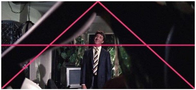
These are patterns you can place within your composition to reinforce the importance of an item or enhance the feeling generated by the piece. The first type of composition I’m going to discuss is the Cross. This is probably the easiest form of composition with which to highlight our main character. Simply put there’s a vertical and a horizontal line that run through the piece and these two lines are perpendicular to each other.
So, let’s look at Winter’s Maw. By adjusting the creature’s right leg upward, I could bring the head and hands in a horizontal line with each other. This coupled with the ice shards on the back and the mammoth skull created a cross composition with the lines meeting right over the face drawing the focus to that place. You may also notice how the
trees in the background help frame the piece. I often like doing back drops to my pieces because it helps direct the viewer to what I want as the front of the piece. It helps define the optimal position I feel to look at the piece.
Notice in this screen shot from Jaws how the wife behind Brody and the flat horizon form a cross that draws even more attention to what the director wants you to focus on, Brody’s face.
The second type of geometrical composition I wish to discuss is the Grid.
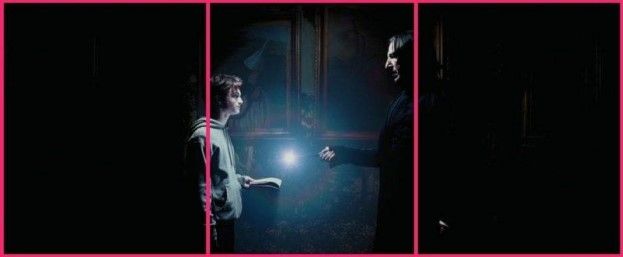
The grid often works well for arranging multiple figures on a single piece. Essentially, we create an imaginary grid with 2 equally placed parallel horizontal and 2 vertical lines creating 9 sections on the grid. We then work to arrange figures in each box or at the points of intersection between grid lines.
This is also known as the rule of thirds.
Take for example Kith, Kriel, and Kin. If you place an imaginary grid over the diorama you can see how pieces are placed in different sections and at points of intersection. (magenta lines) Also as you look at the piece you notice that a tree is used in the upper left corner to draw one’s attention into the piece. If you draw a vertical line through the piece that the two sides are slightly imbalanced. (green line) The impaler troll has slightly more visual weight than the 2 pygmy trolls on the opposite side. In my opinion this help pull the eye in a short of circular motion around the piece to visualize all the aspects. (orange line)
Here is another example of the grid placement in some famous screen shots.
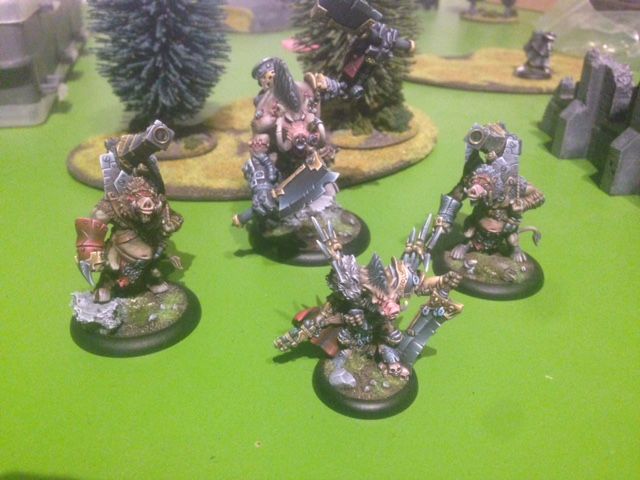
Next let’s discuss diagonal composition. Diagonal compositions are often dynamic and reinforce the feeling of movement in the piece. This can be made even stronger if you combine with additional forms of composition like the grid. Take for example Borka’s Berserkers. Notice how a diagonal line can be drawn through the Earthborn into Borka and then the Axer. This diagonal line reinforces the feeling of movement or charging that is present with the figures in the piece.
The diagonal composition can also be seen in these to screen shots. Note the sense of
movement in these still images.
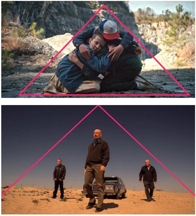
The triangle is another form of composition. Our eyes often scan pieces for basic geometric shapes including the triangle. The triangle composition helps guide our eye to all 3 corners of the triangle and placing objects at these intersections can increase their prominence within the piece. The triangle composition can also lend prominence to items within the shape.
I used a triangle arrangement in my Dogs of War piece. (beige lines) The blue line helps
shows the symmetry in the piece.
This is Blood and Flame by Andrew Leung. Note again how Andrew used a triangular composition to guide one’s eye to each member of the Daughters’ of the Flame and then keep the Dire troll within the triangle composition of the piece.
Also, check out these screen shots and how the triangle composition is used to keep your eye scanning over the piece.
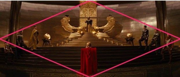
The final geometric shape in composition is the diamond. In the diamond we are lead from one strong focal point at the top out to both sides as we scan the piece and then back to a strong focal point at the bottom. I unfortunately don’t have a personal piece of diamond composition I can show now but please look at these screen shots. Note how you start from a strong upper focal point, scan the piece back and forth, and then end at a strong focal point at the bottom.
That covers the basics of composition. But to paraphrase a famous pirate Captain,
these are more like guidelines than actual rules.
It’s okay to break the rules but you really need to understand what they are first and
why you are breaking them. For instance, you may want to present a desert nomad wandering in a bleak wasteland. In such a circumstance, it may be appropriate to have the nomad on one side of the diorama and the rest be open desert to help symbolize the vastness of the desert and the nomad’s aloneness....
I hope this blog post has laid down the basics of composition in miniature art. Hopefully
this can be applied in your future projects and help you enhance the feeling you wish to convey
with your art. Thanks for reading!
A special THANK YOU to Chris from me and the LITW community!!! If you want to see more of Chris' work check out his Putty&Paint page at: http://www.puttyandpaint.com/DVader


