Showing posts with label Competition. Show all posts

Wednesday, May 31, 2017

ScratchBuild Log Part 5: Final Pics 1915 Curiasse "Fortin" Aubriot-Gabet


So here we are at last and the project was finally done! I am pretty proud of this build. It is not perfect by any stretch but it was a lot of fun and a really new and unique experience for me. I think the finishes on the tank are great and it is a really interesting piece overall.  It won Gold in Vehicle at the Sword And Brush painting competition and 1st place at the local IPMS annual competition. I hope you have enjoyed following the build and if you have any questions do not hesitate to ask!


Thanks greatly to AMMO of Mig Jimenez - this piece wouldn't have happened if not for being thoroughly inspired by the innovative range of products they create. I don't work for them (or any other hobby company) in any capacity but when I see companies like AMMO, Badger, and Happy Seppuku - people who make great things that really ADD to my hobby experience - I don't hesitate to share either! Thanks also to my buddy Trevor Howard for taking these photos for me.

This piece is also on my Putty and Paint page! Id love an extra vote if you are able :)

Tuesday, May 23, 2017

ScratchBuild Log Part 4: Painting the 1915 Curiasse "Fortin" Aubriot-Gabet


So on to the actual paint! Started with a quick shot of Stynylrez. This primer by Badger is the best I've ever used, though **SPOILER ALERT** Ammo of Mig's new one shot primer is the same formulation made by Badger for Mig!!! Partnerships are something AMMO has really been developing as of late - Alclad being another example - What a great way to get an amazing products into even more hands!!

Once primed I reached for the AMMO by Mig Jimenez French WW1/2 Camoflage Colours - a great selection of period appropriate colours, but moreso than that a key selection of skewed grey tones - the light french blue was key in this paint job. I also grabbed some VMA German Grey and some Scale Colour Nacar to do some temperature adjusted contrasting zones in the paint job. With this being essentially a monochromatic model it was important to me to use contrasts of temperature and saturation to create interest in the surface of the model. I tried to create exaggerated and interesting areas of light and accentuated form without making it look completely unbelievable. This can be a difficult line to walk in these early stages as the following filters and layers will dramatically adjust these basecoats in a variety of ways. That being said I nailed 90% of my finishes on the first try. Came back the next day and could see what I wanted to change and made it happen. One of the best starts I have ever had on a model! A quick shot of dullcoat sealed this layer in.


After a little test fitting to make sure all was still properly aligned with the base, the front wheel assembly was removed for separate painting and weathering. I started laying rust tones into the rear roller assembly and then began to apply filters and stains using AMMO of Mig Enamels. Any of my readers will know I love these products and that they have dramatically changed the way I work. Another miniature artist making awesome use of AMMO products is James Wappel - if you don't already follow his incredible mini painting exploits you really should!!!!


While the filters and streaks were drying I started on the wheels where I used a combination of actual chipping with AMMO Chipping fluid and  Layers of paints, enamel rust effects washes and pigments.
I also used a graphite pencil and Forgeworld Dark Iron metallic pigment to add exposed metal marks and edges. While those were drying as well I took the Forgeworld Barbed wire and began to add it to the base as well. It really added life and interest just as I had hoped - Really pleased at this point with everything!  

Once all the parts had dried it was time for test fitting on the base again


So with that it was time to add more marks and interest across the surface of the hull. Some painters like to refer to this as more "information". Even if (especially if?) it is subtle it really engages the viewers brain more.   Sometimes it can also forward the story element by relating the piece to its environment. As this is designed to drive through barbed wire I wanted to make sure it has many little scratches across the lower hull in particular. These were painted with care and individually highlighted.


Once I had addressed surface detail and finish it was time for environmental effects - I like to think of my models in layers - Base coat and basic lighting come first. Filters and surface treatments are next. Weather/environmental factors are layered last. So I began by breaking out more of my AMMO of Mig enamels and using them to simulate a first spattering of mud - basically older dryer splashes that would have a matte finish against the slightly satin hull. I loaded up a large brush with the enamel mud and held it near the hull behind the position where the wheel would be. Using the airbrush I shot bursts of air effectively "flicking"  the bristles and giving a natural distribution of spatter across the hull. This was a VERY effective way of simulating the mud and filth that would be spattered by the turning wheels in this wet landscape.


While waiting for this to dry I also attached the extension cord that ran from the back of this wild little electric vehicle back into the friendly trenches (this easily severed and unreliable power source was one of the key reasons cited in abandoning this project after building only the one prototype!).  I also fit and primed the sandbags and supports and began to paint and weather them using a mix of acrylics and enamels. I wanted them to be harmonious with their muddy surroundings to be an accentuating detail rather than a secondary focal point. When finished they help lead the eye into the scene rather than drawing strong attention to themselves. Even the way they are stacked is to emphasize an upward movement pointing towards the tank.

Once the body was dry and the bags were in place I mounted the tank to the base and moved toward final harmonization - making sure it looked as though it was part of the scene and not just placed on top of it. I began by adding the next layers of dimensional mud. Made with pigment, acrylic pigment resin, paint, a little bit of gravel, static grass and some plaster this sticky mess matched the groundwork beautifully. It needed to be applied in stages, however, to build up naturally and to hold the dimension. It was really important to pay attention to the front wheels in this stage and make sure they looked partially sunk/dug in.


As the mixture was built up it was also added to the sandbags and areas of the base with additional roots and plant matter mixed into it - to keep the finish natural and to ensure harmony.


With that it was only a matter of small touch ups and finishes - highlighting the wooden posts, using dark iron pigments and black pigments on the gun barrel and metallic components with Ammo pigment fixer and a few more streaks etc with AMMO rust streaks and track wash. 

Next Week - Finished photos!


Tuesday, May 09, 2017

ScratchBuild Log Part 2: 1915 Curiasse "Fortin" Aubriot-Gabet


Balsa Foam armature
So having decided to build this rare oddity of WW1 (a French prototype trenchbusting "tank" made of a tractor with a concrete reinforced turret and an extension cord/ power cable that connected it back to its own trenchline.... not hard to believe they only made one eh?) it was time to start cutting styrene and creating forms.

Initially I was struggling a little - I new I could build the general body forms around a skeleton of balsa foam - this material is easy to glue and cut to shape and sandable to give the opportunity to perfect any complex forms or curvature that would be very difficult to build straight away in styrene without the armature.

I also had a brilliant idea about how to create strong armatures for the circular central body forms! I too two rolls of tape and removed excess layers of tape until they were both the same diameter the one was a little tall so i slid it through my bandsaw to shorten it slightly. Once that was done it was a piece of cake to clas the armature in plastic using thin styrene and Bondene solvent glue.


I also formed the concrete "roof" out of balsa foam which I sanded and filed into shape. In order to ensure that it would take paint well and to avoid further damage or distortion I used a foam glue that is more or less a thinned pva. It absorbs into the foam and seals it making it stronger overall in the process.


While that was drying I set about constructing the wheels. I hunted down a couple of plastic lids that were the appropriate diameter and then wrapped them in styrene. While those were drying I started chopping styrene square rod to appropriate lengths for the welded teeth-like of the wheels.


To ensure I got them placed correctly I took an extra copy of my blueprint and a xylene marker - note this is some pretty nasty stuff to be using in hobby projects but it certainly did the job in this case.as it transferred the pattern from the page onto the plastic. From there the spokes an inner supports of the wheels were constructed out of various thicknesses of styrene and adhered with Bondene.
The center Hubs were initially roughed in with Apoxie Sculpt. but i eventually abandoned these in favor of some better representative parts scavenged from another kit.

Around this time I also cut open a Brita water filter and started separating the beads inside by size. Using a tiny awl I began to punch small divots in the plastic body panels and using an old bent airbrush needle as an applicator

I carefully placed a drop of glue on each indent and then adhered a single Brita bead to each spot. It is slow and patient work but a great way to create rivets on a surface like this!

Once the rivets satrted to go on this really took shape and the overall direction became very clear. I mocked up the appropriate forms for the rear roller and supsension and started on the inital assembly. It was really starting to look good IMHO!


I still needed a way to attach the turret to the hull and came up with an incredibly simple solution that would allow me to position it later once I had figured out the model facing and best compositional lines - I simply used more balsa foam inside the turret and body and a plastic tube as a swivel point. A little apoxie sculpt made sure that it wouldn't move . The alignment was perfect.


From there it was just a little fine tuning around a couple seams and it would be ready for paint!


Next week Developing the Groundwork and Starting the Paint!


Tuesday, May 02, 2017

ScratchBuild Log Part 1: 1915 Curiasse "Fortin" Aubriot-Gabet

Here is the build log for my 1915 Curiasse "Fortin" Aubriot-Gabet (Experimental Electric Armoured Vehicle) Scratchbuild in 1/35

Designed in 1915, the Aubriot Gabet “Fortress” was considered as a way of pushing across the dangers of no man’s land. The armoured Body was fitted to a Flitz tractor chassis to provide protection for a crew of 2 (driver and gunner) and featured a 37mm Navy Cannon.
It was electrically powered by an external source which meant a long cable was required to trail behind it as it rolled through the fields of barbed wire and shell craters. This left it extremely vulnerable as any damage to the power line meant that it would grind to a halt.

Only a single prototype was built and tested before it was determined the design flaws were too significant to continue development, and only a single grainy photo of this remains. 
There does not appear to be any company manufacturing a model of this at this time (nor in the past) so it looked like it could be really fun and a chance to finally scratchbuild something!
Since many of the details were not shown in the picture (like the door to get in and out for example!) I looked to other experiments of the era to draw inspiration from - such as the Fahrpanzer rolling turret emplacement.


 I also found this rather handy digital illustration and tiny resin miniature that was being sold on ebay.  Though it was clear that this maker had altered some of the details (like the rear roller mount) and the placement of the door made no sense considering the large electrical cable that is supposed to hang from the back of this vehicle, it was really helpful to see a clear 3-d interpretation of the forms.
  

Finally, I came across a 1/35 paper model that I could purchase the download for $4 !!! Huzzah! This became the basis for my measurements and made the whole process a real treat. If anyone else decides to build one based on what they see here I highly recommend using this as your starting point.

Now it was time to begin scratchbuilding!!!!! Cya next week with details on how :)

Tuesday, April 04, 2017

Sword and (CRYSTAL) Brush!!!!! New Canadian Qualifier!!!!!

No secret that I look forward each year to the Sword and Brush Competition in Toronto Ontario Canada and today they dropped some Truly EXCELLENT news!!!

From Sword&Brush Organizer Alex McCutcheon:

Great news! Sword & Brush is proud to announce that we are now a Crystal Brush qualifier! 

Crystal Brush is a prestigious miniature painting show held every year at Adepticon in Chicago that attracts painters from all over the world. The Best in Show award at our show will receive free airfare to the 2018 Crystal Brush for a chance to win up to $10,000!

Thanks to the fine folks at CMON for including us as a qualifier. For more info about Crystal Brush, please visit their website:

http://www.crystalbrush.com/ 

So excited that this added dimension (and added draw) has been...well... added..... to one of my favorite events!
I expect that this means the already high level of competition is about to become even more fierce!!!

Keep up to date with the Sword and Brush at their facebook page:
https://www.facebook.com/swordandbrush/

Note: you dont have to win at one of these qualifier events to attend Adepticon and enter crystal brush - it is just a cool way to win a flight to the event!!!!

Friday, March 31, 2017

Adepticon Aftermath 2017


So my first Adepticon has come and gone! And it was simply amazing.

People who were there know what I mean - the congratulatory and thankful facebook posts have been rolling through my page filled with tags for seemingly half my friends list, and dozens of people have asked to become my new FB friend.

It was an epic community building event.

That aside, I was in a rather unique position as I was asked to help judge the Crystal Brush painting competition.

This was an incredible honor (and one I sincerely hope to repeat some day) and also a duty that I took very seriously.

I will admit I was rather nervous having to be hyper critical and to give not only my opinion to the other judges (the amazing duo of  Angel Giraldez of Luxumbra/Studio Giraldez/Corvis Belli and Jose Nunez Palomares of Big Child Creatives)  but also constructive feedback to my peers, many of whom I have known for years. In my opinion, it is sometimes harder to be vigilant and critical with friends than with strangers - and this event was full of friends and artist who I have admired for years. As a lifelong student of the Arts and an art teacher for the last 17 years, however, critique is simply part of the job and understood as a neccesity for growth. I know that there are those who I lean on for important constructive feedback.  Dragomir Milanovic whose work I have featured here on several occasions is one such friend that I rely heavily on, and without David Diamondstone's acute critical eye I don't know that I would have been able to push my Boromir bust past the Silver level it attained at GenCon to the Gold it earned in Sword and Brush.

So I judged by the spirit and the letter of the competition. It was exhilarating. Moreso than that it went incredibly smoothly! I couldn't have asked for a better team. Our scores were very uniformly close and showed that we all shared a keen understanding of not only what we were looking at but how we would rank them.

When there was divergence we discussed, but in the end we each scored within a point of another judge on every entry. It was clean and definitive and then handed on to the community to complete the scoring by voting through the website on the incredible photos prepared through the massive efforts of Jennifer Haley.

I am proud of our work and I stand by it.


All of the pieces that were voted upon are available to view at CMON. They were incredible. Many genuinely wonderful creations of form and colour from Raffa, Ben, Sergio, Francesco, Suhre, Kat, etc - so many incredible painters and modelers. By now I'm sure you have seen these or seen them discussed at length. So today I would like to add something else to the discussion, I'd like to mention a few pieces here today that were not the big winners but made a strong impact on me at the event. I have been asked many times now what some of my favorites were -irrespective of score - so here is a list in no particular order of a few entries that resonated with me at Adepticon that you may not have seen yet.....


1. David Diamondstone - The White Orc.
You probably did see this one as it was one of the ones in the running but I decided to include it anyway. One of my favorite pieces in the show and one that I used as an example in discussions throughout the weekend. this piece was a legitimate contender in a stacked category. I have seen and enjoyed this sculpt on the internet many times but this is by far my favorite iteration. The textures in the leather are incredible, the sense of light is subtle and beautiful and the design on the shield is immaculate in its execution. The variety of surfaces depicted is so convincing. I love this piece and will remember it for years to come.


2. Cadwallon by Michael Stubbs - this simple approach to sculpting the background elements was refreshing and just really good! I liked that aspect very much and have filed it away in my memory.....


3. Lauren Fahey (Griffons Roost Painting) - Fade (Kingdom Death) This was a really lovely piece that had beautiful skin tones, solid composition (great use of the vegetation to move the eye around and an interesting way to break up the traditional plinth to create greater interest and movement) and some really great details throughout. Plus the artist was super nice.


4. Cygnar Stormwall - While the finish on it was a dusty drybrushed type of surface that was difficult to take great photos of - the overall impression of this model was excellent. The colour combinations were really cool and the overall level of detail was really great.


5. Monk - mini diorama by Michael Stubbs - Michael again on this list - not because I have known him for years or because I thoroughly enjoy his sense of humor, but rather because his understanding of the "rule of cool" always shines through in his work. He gave a great deal of thought to the overall presentation of this little vignette and the extra details - like the porcelain planters with individual blue glazework designs and the beautiful little koi - are simply cool. I really enjoyed seeing this.


6. Alien Queen - a simple but incredibly effective piece with a HIGH "cool factor". The scene told a clear story and the whole thing was painted very clean. I desperately wish I had a better picture of this! If anyone out there does - I would love to replace this one as it does the little scene zero justice!


7. Zelda - I can save myself - by Seth Walker. Yeah this was up for voting too but i wanted to revisit it because I had a really fantastic critique and discussion with Seth about taking his work to the next level. This led to one of the best parts of the whole weekend for me where he found me a couple hours later in the hallway to show me a new WIP where he was applying the ideas we discussed. It was so clear that he understood and he was so excited that it was truly infectious happyness! I look forward to seeing what comes in the next year from him.....


8. Mordacius Tranquility by Seth Amsden (a different Seth than above!) - the application of painting technique may have been a little oversimplified here but the overall impression was fantastic! I LOVED the composition, the way the natural elements framed the scene and the energy of the rabbit jumping forward - a Kingdom death meets Alice in Wonderland moment to be sure. the sense of dramatic lighting was clever and the whole thing was really really pleasing. Genuinely loved this piece.

Unfortunately there are a few that I really liked that I do not have proper phots of - including Russo's Darth Maul and Mecha entries - But with that being said I do have a few more nice shots to share so I will leave a link for a slide show of some of my shots from across the event here - hope you enjoy as much as I have!


(thats a lie.. you wont.... I enjoyed this too much for you to possibly feel the same... :P )
See you Next week!


Thursday, February 09, 2017

I AM JUDGING YOU!!!

Well sort of.

If you come to Adepticon.... and enter Crystal Brush.

Posted now on the Crystal Brush website under the heading "Meet Our Guest Judges for 2017"


It is an INCREDIBLE honor to have been asked to be a part of this! Really makes a guy feel valued in this community. Thank you to Jen Haley for the kind words in my intro. :)

Being a volunteer in a role like this carries a lot of responsibility and I am definitely feeling anxious, but I really think it will be a fun, educational and community building experience without parallel.

I hope to be able to connect with many of my artistic peers - both old friends and those who I have not yet met face to face. I look forward to working with, learning from, and sharing insights with you all. This is going to be a weekend of painting, sculpting, sharing and inspiration to be sure.

See you soon
James

PS - if you follow this blog but prefer Facebook - I have a mirror there with additional content https://www.facebook.com/lostinthewarp/

Tuesday, January 31, 2017

Out of the Darkness - Chris Suhre's Spotlight on Composition

Hello everyone!

My name is Chris Suhre and I’m an amateur hobbyist/painter. This will hopefully be the first in a

long series of blog post on various miniature/hobby topics. (I hope so to! - J)

I thought I’d start off by discussing composition in competitive painting. Hopefully it’s no big surprise that to do well in painting competitions you must have a great grasp of color theory, lighting effects, and painting techniques like blending and such. But having well composed settings can also help you present a much more pleasing ensemble to your viewer.

Have you ever noticed that certain dioramas keep your eye traveling around while others seem scattered? This is due to composition of the setting. This blog post will help discuss some of the elements of composition and how we can use them to reinforce the feeling we want to invoke in our viewer. Composition is not just in miniature painting though. It can also be seen in other art forms as well such as movies and classical painting.

But before we really get started I just wanted to note a few excellent resources for composition. Many of the ideas I will discuss are thanks to these resources. The Rise of Fantasy is an excellent book by Juan Barrena that discusses many of the points I will make in this blog post.

Another great book resource is Modeling Stories in Miniatures by Antonio Fernandez Lizaso. Also, while preparing this article I came across The Art of Composition 140 Iconic shots on Facebook. We will be looking at a few of these iconic scenes in this post. Finally, the online site Massive Voodoo is a library of useful information for any painter/hobbyist.


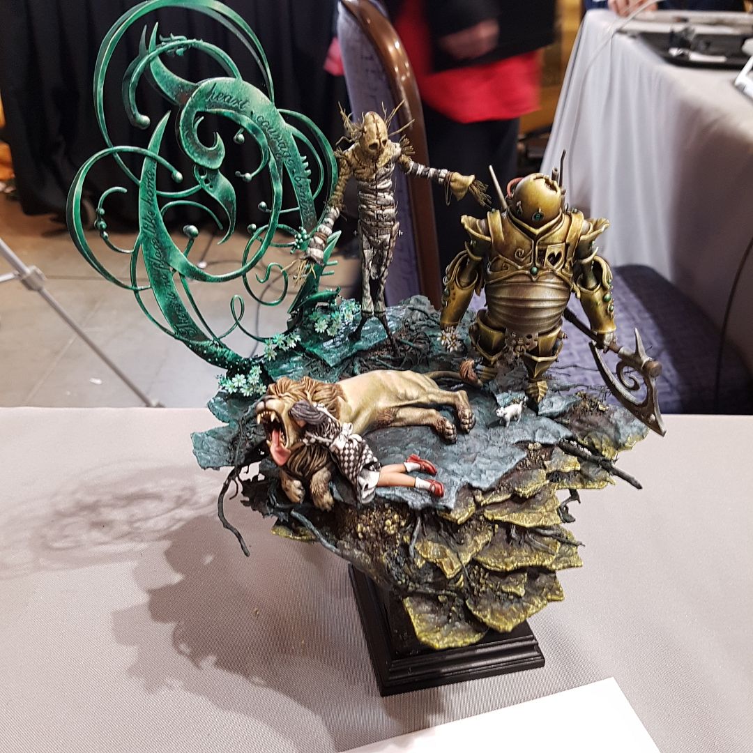
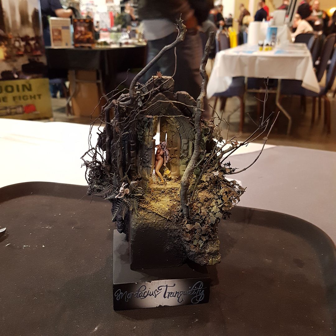
So, the first area to address is forced composition vs natural composition. In forced composition, we are often lining our model up with the scenery around them in parallel lines. This gives a forced or artificial feel to the piece. This is often what we see in family photos. Everyone is lined up and placed in front of scenery or behind it but not actually interacting with it. Forced composition can work on a display piece but you should realize it will give you a more photographed/posed effect. Natural composition is when there is a lack of parallel lines in a piece. This is more often what we see in dioramas where there is a battle. That doesn’t mean there can’t be good composition within the piece yet. Just that warriors on opposite sides of the battlefield shouldn’t be directly lined up against one another.

This is the Devil Shadow Mutineer’s by the incredibly talented Kat Martin. This is an example of forced composition. Notice how it almost seems like the crew members came out of the bar and then posed for a picture. They are arranged with a back drop that fits the models and scene but they really aren’t interacting with it. Note the parallel lines within the piece. The miniatures backs line up in parallel lines to the bar wall behind them.


Next is balance. In general, we want the final symmetry in a piece to be balanced. What this means is that when the piece is divided in half vertically it should appear to have the same “weight” on both sides. Now this can often be done simply by making sure the same number of items are present on each side. For instance, having a 5 man unit of troops. Having the leader in the middle with 2 troops on either side produces a simple balance/symmetry to the piece. This is also known as perfect balance, when all items are distributed evenly both in quantity and weight between both sides of the piece. There is also balance by equivalence when you have a large item on one side and its visual weight is balanced out by numerous smaller items on the other side. It should also be noted that balance can not only be created by the weight or quantity of items but by color itself. Warm colors (red, yellow, etc) have a higher visual weight than cold colors.

Look back to the Mutineer’s by Kat. The scene can easily be divided down the middle vertically with a member on either side and a balance in weight of the items on each side on the back wall.

Once again notice the symmetry and forced composition in this scene. The items, hues, and light are equal on each side making this a perfect symmetry.


And this one.


Okay so now let’s dive into composition styles/lines. Just a few general notes to start....

First, I often like to have an item in the upper left hand corner of the piece that grabs the eye and then pulls the eye into the piece. This is often something as simple as a tree, rock formation, banner, etc. We typical read from left to right so this helps one grab the viewer’s eye and pull it into the piece.


In my “Into Darkness” diorama I use a ruined stone column to grab the viewer’s eye and then that eye is pulled along the wooden support beam into the first member of the wither shadow combine. In this piece, you may then notice how the first member of the unit then looks in the direction of the second who then looks to the third helping to direct the eye through the entire piece. (orange lines) Another general idea about composition is framing the scene. In this case, we’re talking about using items to help contain the vision we want the viewer to see. Returning to the “Into Darkness” diorama note how the ruined rock column and wooden support beam also help frame and define the edges of the piece. (green lines)


Now that we’ve hit on the ideas of forced vs natural composition and symmetry/balance vs symmetry let’s discuss geometrical types of composition.

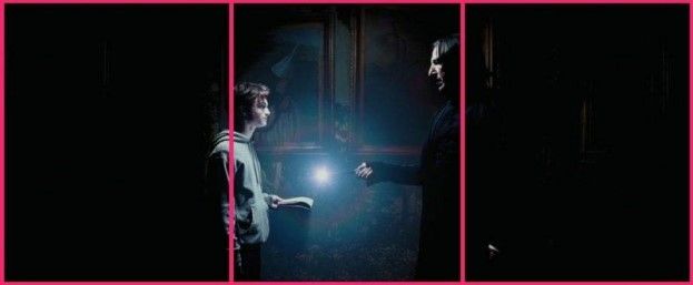
These are patterns you can place within your composition to reinforce the importance of an item  or enhance the feeling generated by the piece. The first type of composition I’m going to discuss is the Cross. This is probably the easiest form of composition with which to highlight our main character. Simply put there’s a vertical and a horizontal line that run through the piece and these two lines are perpendicular to each other.

So, let’s look at Winter’s Maw. By adjusting the creature’s right leg upward, I could bring the head and hands in a horizontal line with each other. This coupled with the ice shards on the back and the mammoth skull created a cross composition with the lines meeting right over the face drawing the focus to that place. You may also notice how the
trees in the background help frame the piece. I often like doing back drops to my pieces because it helps direct the viewer to what I want as the front of the piece. It helps define the optimal position I feel to look at the piece.

Notice in this screen shot from Jaws how the wife behind Brody and the flat horizon form a cross that draws even more attention to what the director wants you to focus on, Brody’s face.


The second type of geometrical composition I wish to discuss is the Grid.

The grid often works well for arranging multiple figures on a single piece. Essentially, we create an imaginary grid with 2 equally placed parallel horizontal and 2 vertical lines creating 9 sections on the grid. We then work to arrange figures in each box or at the points of intersection between grid lines.
This is also known as the rule of thirds.


Take for example Kith, Kriel, and Kin. If you place an imaginary grid over the diorama you can see how pieces are placed in different sections and at points of intersection. (magenta lines) Also as you look at the piece you notice that a tree is used in the upper left corner to draw one’s attention into the piece. If you draw a vertical line through the piece that the two sides are slightly imbalanced. (green line) The impaler troll has slightly more visual weight than the 2 pygmy trolls on the opposite side. In my opinion this help pull the eye in a short of circular motion around the piece to visualize all the aspects. (orange line)


Here is another example of the grid placement in some famous screen shots.


Next let’s discuss diagonal composition. Diagonal compositions are often dynamic and reinforce the feeling of movement in the piece. This can be made even stronger if you combine with additional forms of composition like the grid. Take for example Borka’s Berserkers. Notice how a diagonal line can be drawn through the Earthborn into Borka and then the Axer. This diagonal line reinforces the feeling of movement or charging that is present with the figures in the piece.


The diagonal composition can also be seen in these to screen shots. Note the sense of
movement in these still images.


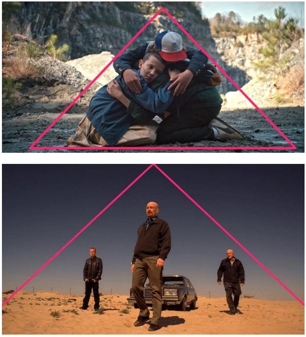
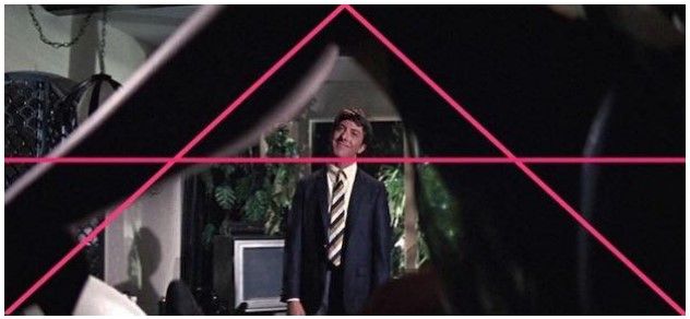
The triangle is another form of composition. Our eyes often scan pieces for basic geometric shapes including the triangle. The triangle composition helps guide our eye to all 3 corners of the triangle and placing objects at these intersections can increase their prominence within the piece. The triangle composition can also lend prominence to items within the shape.


I used a triangle arrangement in my Dogs of War piece. (beige lines) The blue line helps
shows the symmetry in the piece.


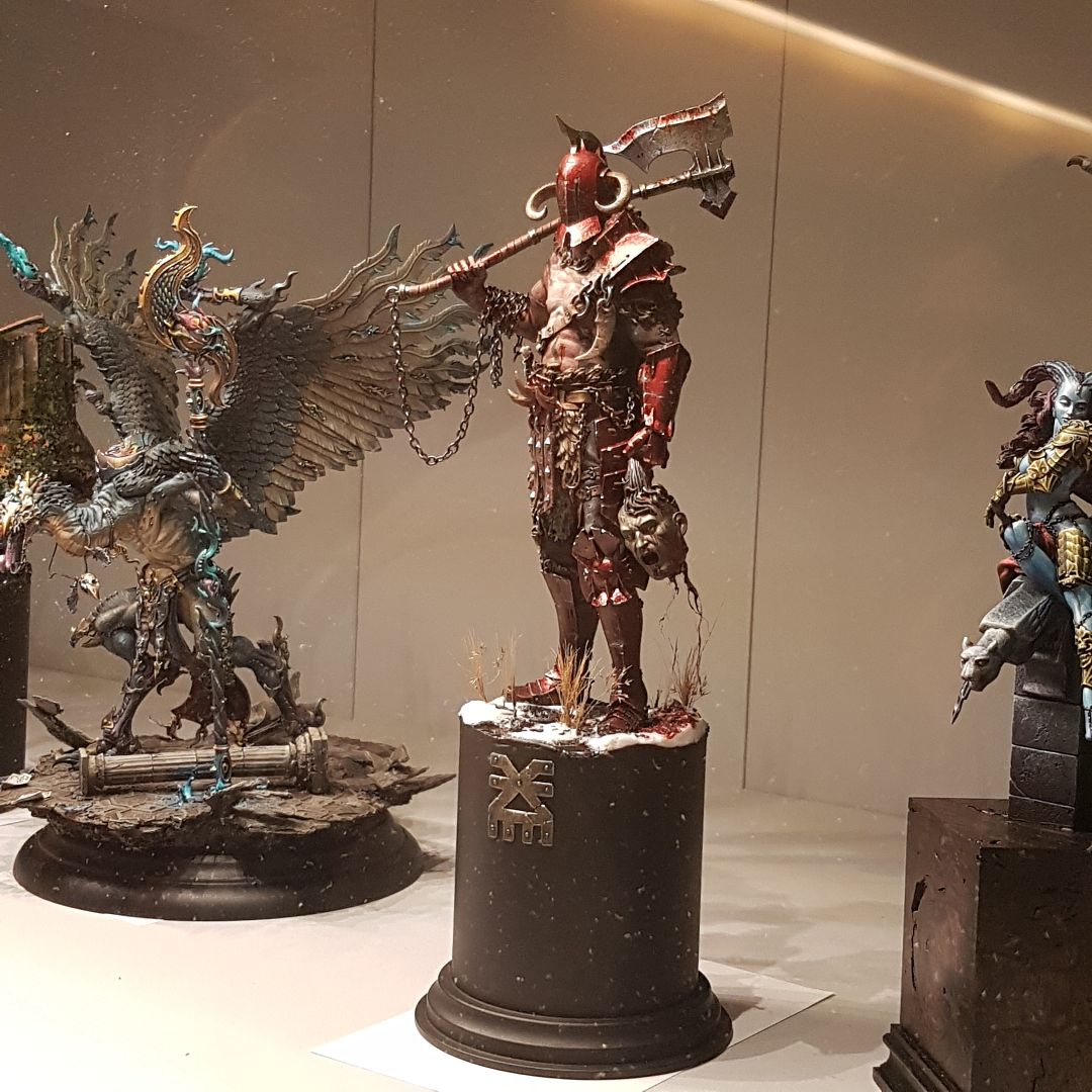
This is Blood and Flame by Andrew Leung. Note again how Andrew used a triangular composition to guide one’s eye to each member of the Daughters’ of the Flame and then keep the Dire troll within the triangle composition of the piece.

Also, check out these screen shots and how the triangle composition is used to keep your eye scanning over the piece.


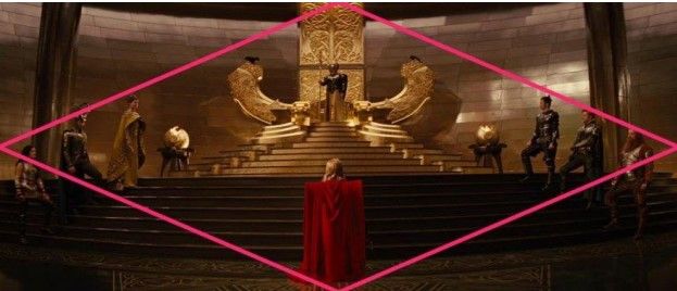
The final geometric shape in composition is the diamond. In the diamond we are lead from one strong focal point at the top out to both sides as we scan the piece and then back to a strong focal point at the bottom. I unfortunately don’t have a personal piece of diamond composition I can show now but please look at these screen shots. Note how you start from a strong upper focal point, scan the piece back and forth, and then end at a strong focal point at the bottom.


That covers the basics of composition. But to paraphrase a famous pirate Captain, these are more like guidelines than actual rules.

It’s okay to break the rules but you really need to understand what they are first and why you are breaking them. For instance, you may want to present a desert nomad wandering in a bleak wasteland. In such a circumstance, it may be appropriate to have the nomad on one side of the diorama and the rest be open desert to help symbolize the vastness of the desert and the nomad’s aloneness....

I hope this blog post has laid down the basics of composition in miniature art. Hopefully
this can be applied in your future projects and help you enhance the feeling you wish to convey
with your art. Thanks for reading!

A special THANK YOU to Chris from me and the LITW community!!! If you want to see more of Chris' work check out his Putty&Paint page at:  http://www.puttyandpaint.com/DVader