Showing posts with label Bust. Show all posts

Friday, March 31, 2017

Adepticon Aftermath 2017


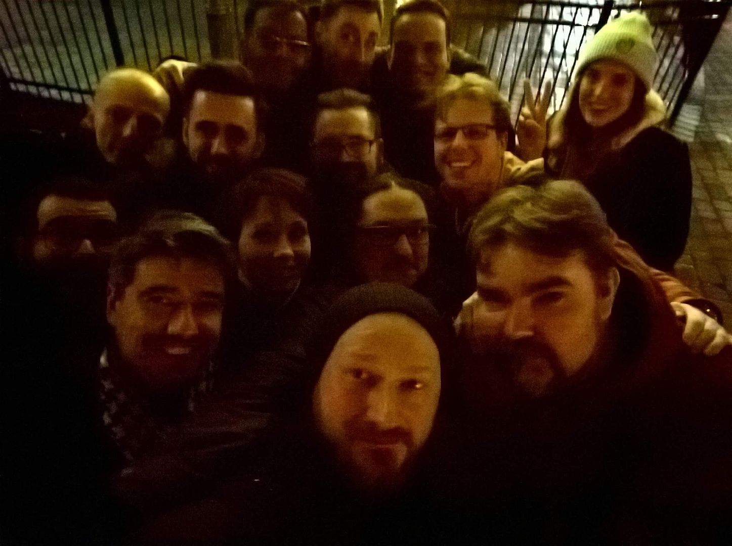
So my first Adepticon has come and gone! And it was simply amazing.

People who were there know what I mean - the congratulatory and thankful facebook posts have been rolling through my page filled with tags for seemingly half my friends list, and dozens of people have asked to become my new FB friend.

It was an epic community building event.

That aside, I was in a rather unique position as I was asked to help judge the Crystal Brush painting competition.

This was an incredible honor (and one I sincerely hope to repeat some day) and also a duty that I took very seriously.

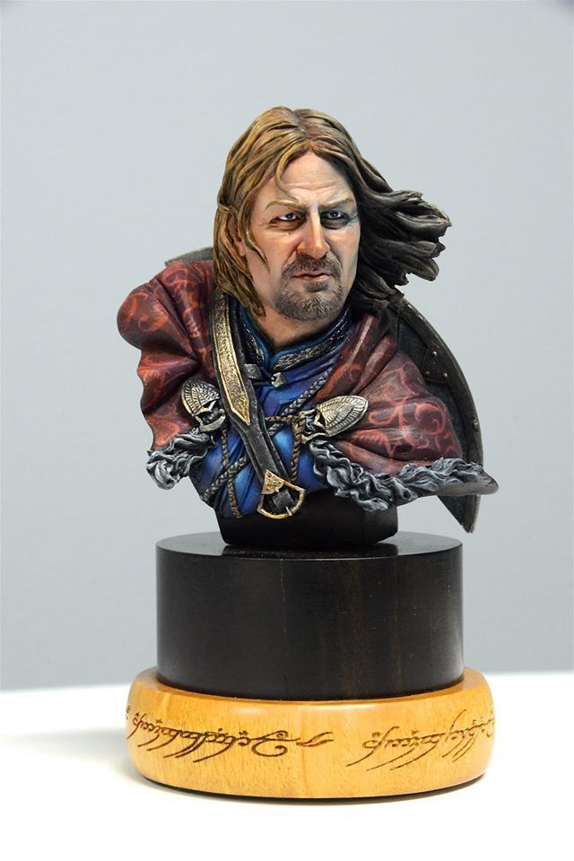
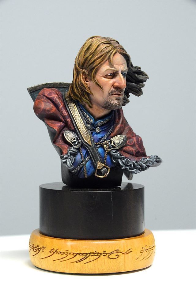
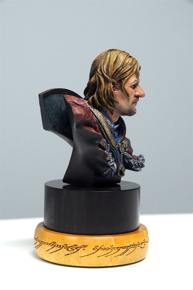
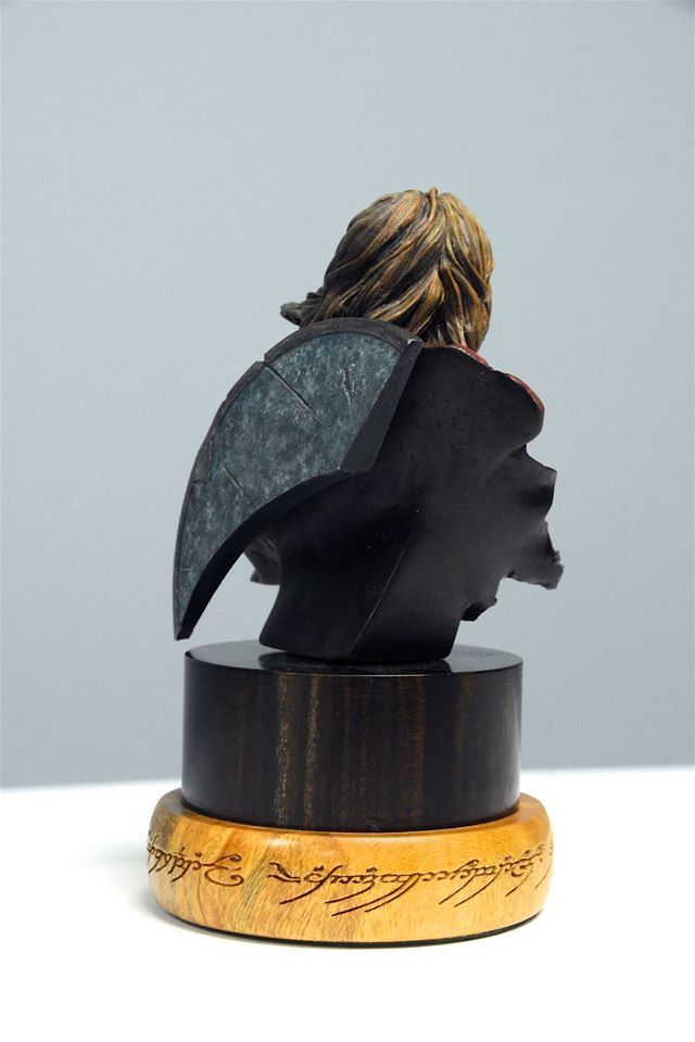
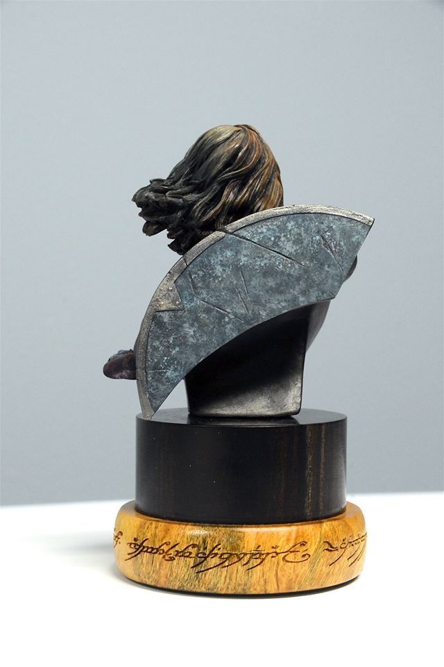
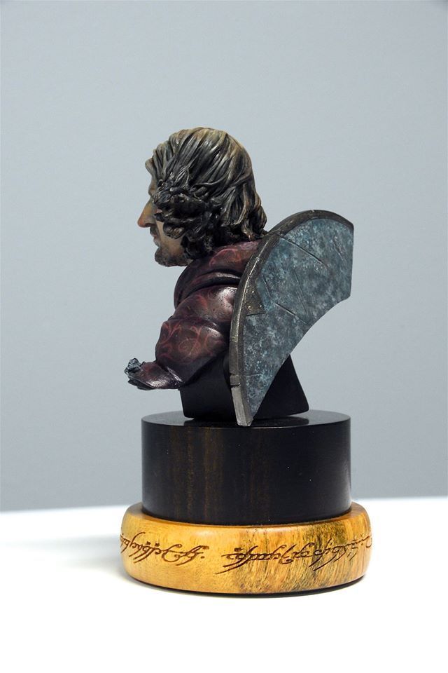
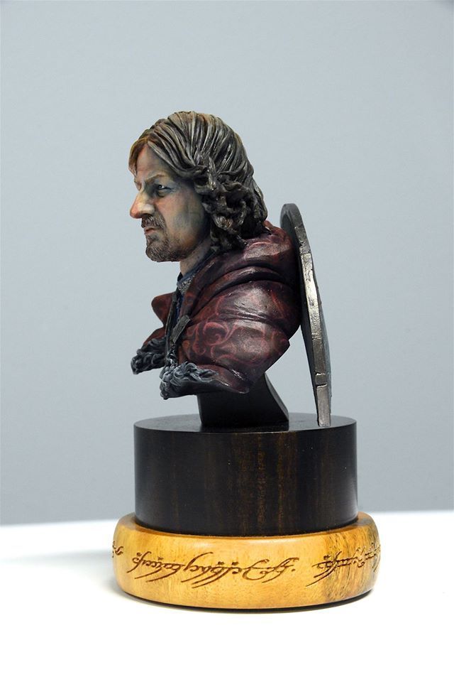
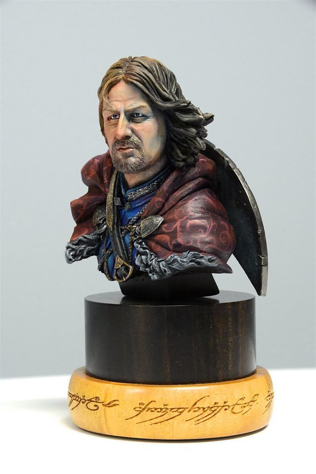
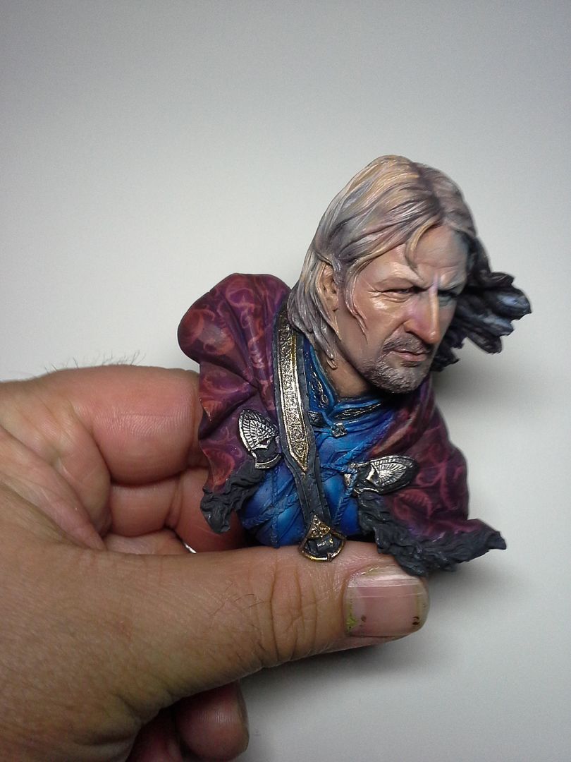
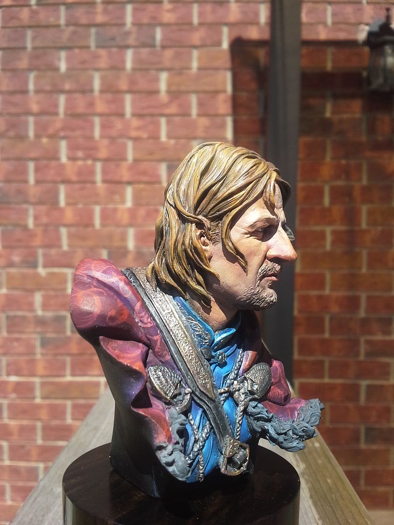
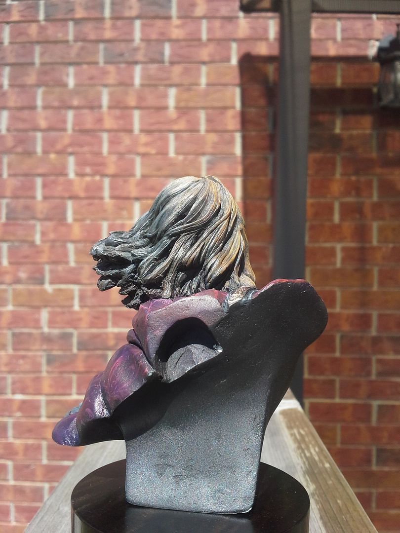
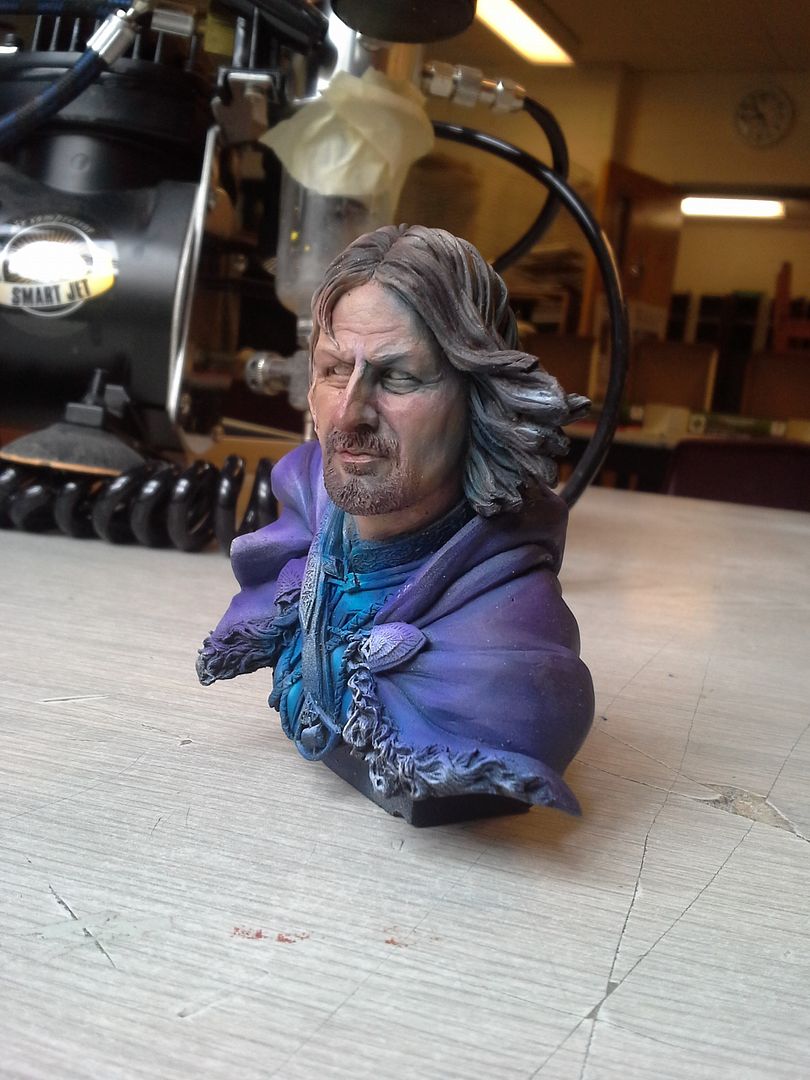
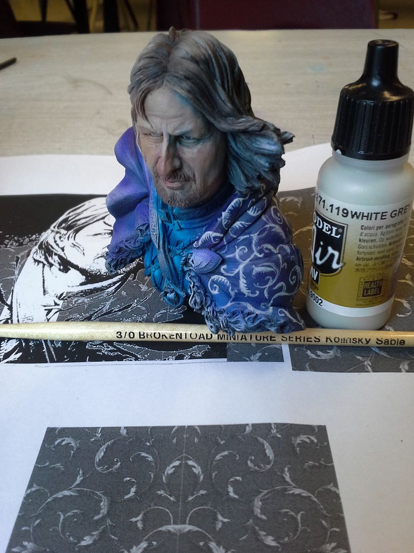
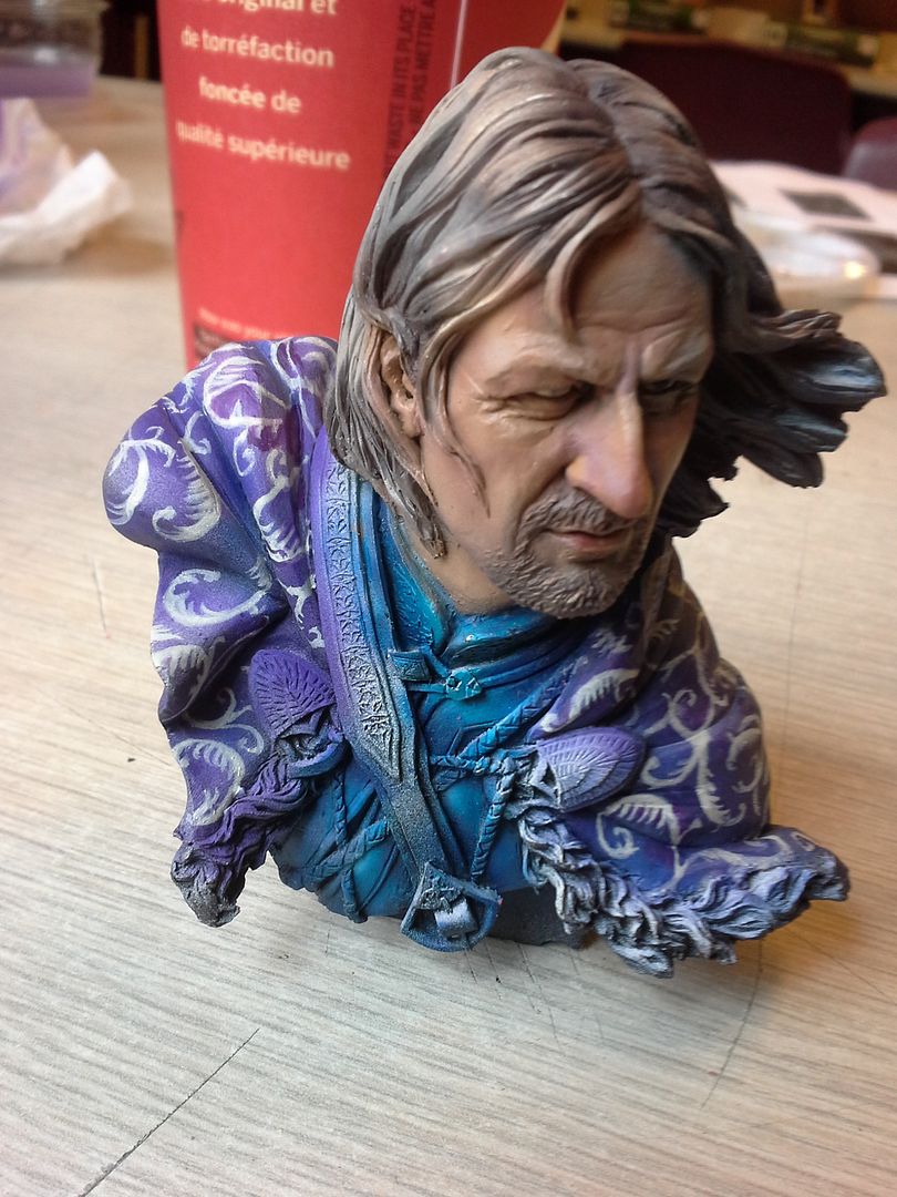
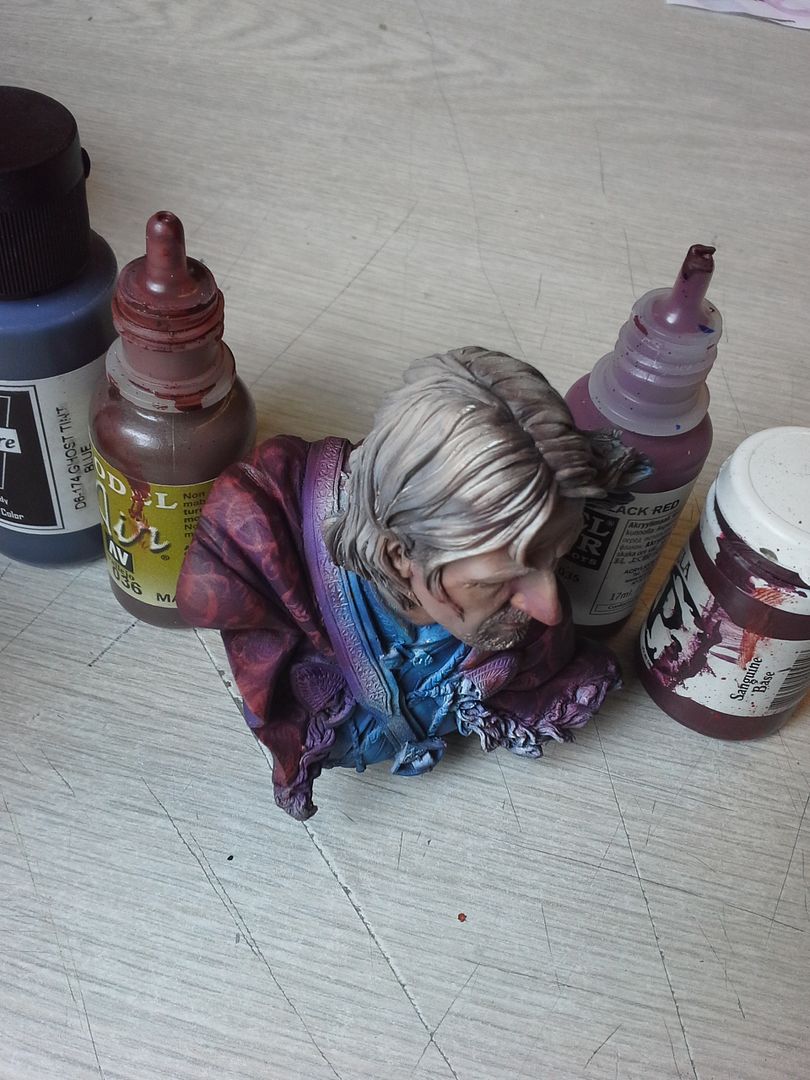
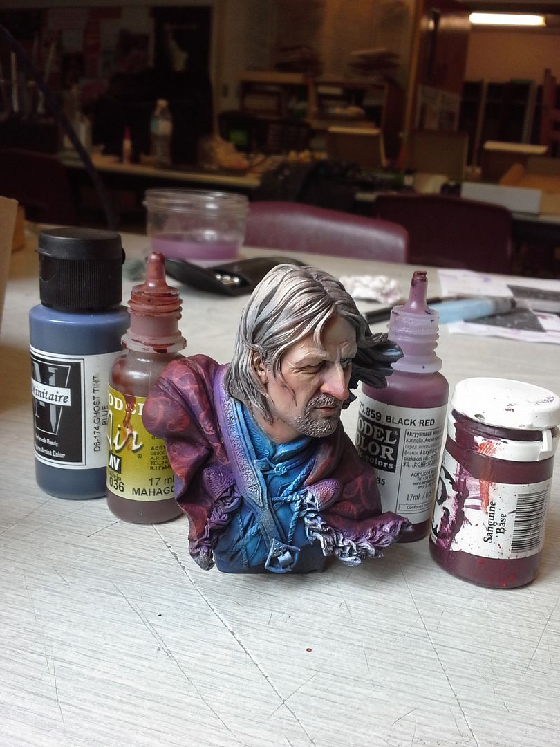
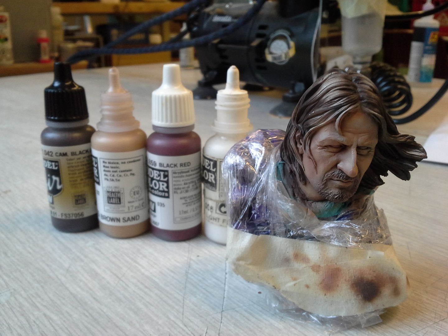
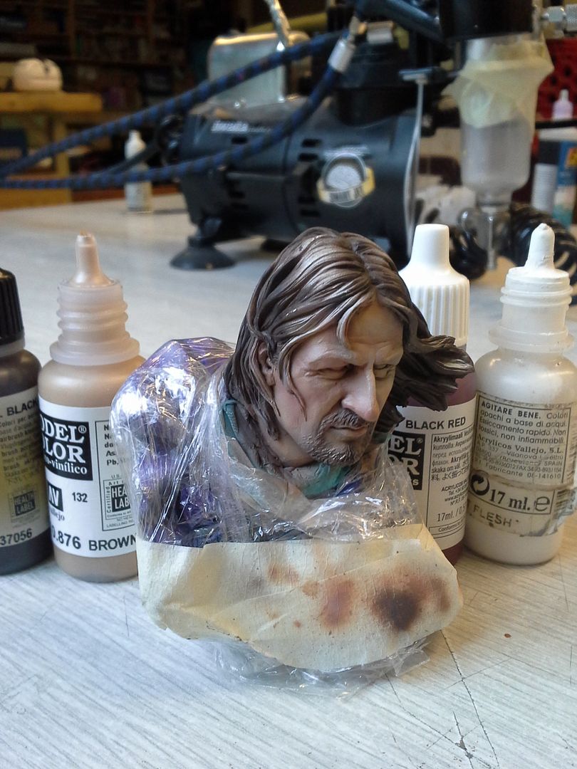
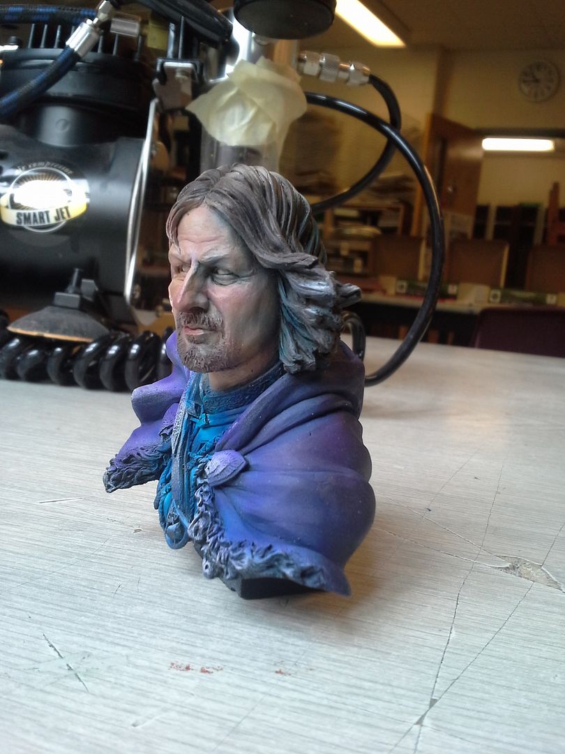
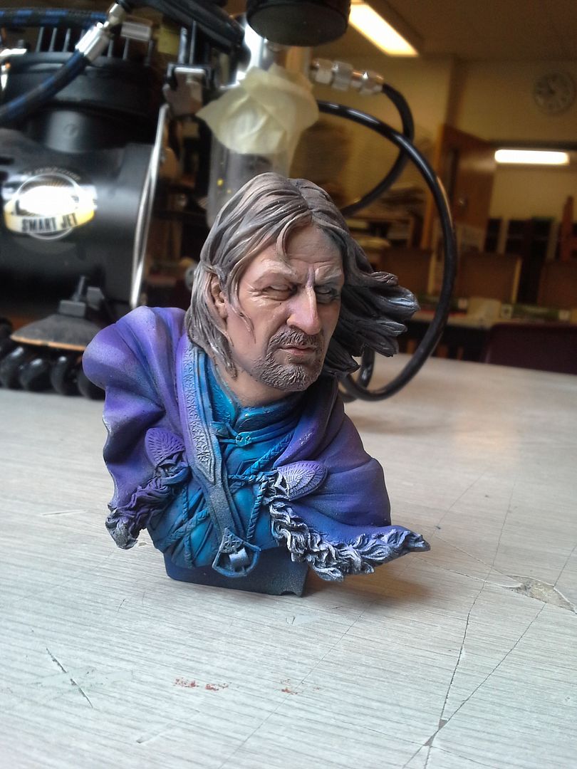
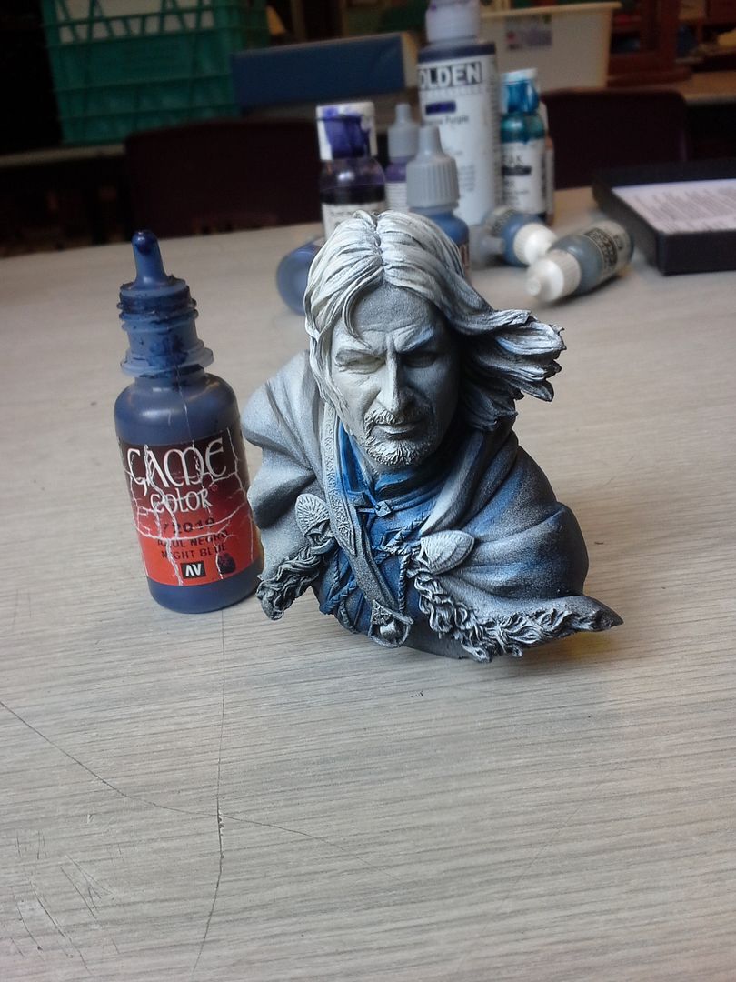
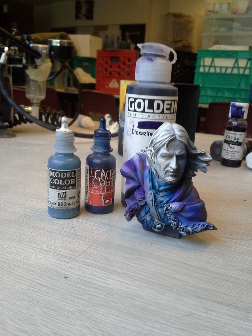
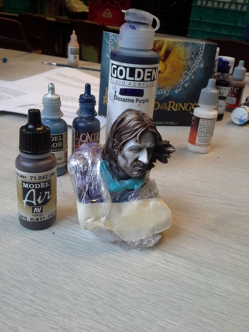
I will admit I was rather nervous having to be hyper critical and to give not only my opinion to the other judges (the amazing duo of  Angel Giraldez of Luxumbra/Studio Giraldez/Corvis Belli and Jose Nunez Palomares of Big Child Creatives)  but also constructive feedback to my peers, many of whom I have known for years. In my opinion, it is sometimes harder to be vigilant and critical with friends than with strangers - and this event was full of friends and artist who I have admired for years. As a lifelong student of the Arts and an art teacher for the last 17 years, however, critique is simply part of the job and understood as a neccesity for growth. I know that there are those who I lean on for important constructive feedback.  Dragomir Milanovic whose work I have featured here on several occasions is one such friend that I rely heavily on, and without David Diamondstone's acute critical eye I don't know that I would have been able to push my Boromir bust past the Silver level it attained at GenCon to the Gold it earned in Sword and Brush.

So I judged by the spirit and the letter of the competition. It was exhilarating. Moreso than that it went incredibly smoothly! I couldn't have asked for a better team. Our scores were very uniformly close and showed that we all shared a keen understanding of not only what we were looking at but how we would rank them.

When there was divergence we discussed, but in the end we each scored within a point of another judge on every entry. It was clean and definitive and then handed on to the community to complete the scoring by voting through the website on the incredible photos prepared through the massive efforts of Jennifer Haley.

I am proud of our work and I stand by it.


All of the pieces that were voted upon are available to view at CMON. They were incredible. Many genuinely wonderful creations of form and colour from Raffa, Ben, Sergio, Francesco, Suhre, Kat, etc - so many incredible painters and modelers. By now I'm sure you have seen these or seen them discussed at length. So today I would like to add something else to the discussion, I'd like to mention a few pieces here today that were not the big winners but made a strong impact on me at the event. I have been asked many times now what some of my favorites were -irrespective of score - so here is a list in no particular order of a few entries that resonated with me at Adepticon that you may not have seen yet.....


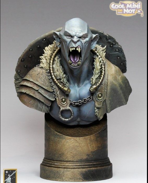
1. David Diamondstone - The White Orc.
You probably did see this one as it was one of the ones in the running but I decided to include it anyway. One of my favorite pieces in the show and one that I used as an example in discussions throughout the weekend. this piece was a legitimate contender in a stacked category. I have seen and enjoyed this sculpt on the internet many times but this is by far my favorite iteration. The textures in the leather are incredible, the sense of light is subtle and beautiful and the design on the shield is immaculate in its execution. The variety of surfaces depicted is so convincing. I love this piece and will remember it for years to come.


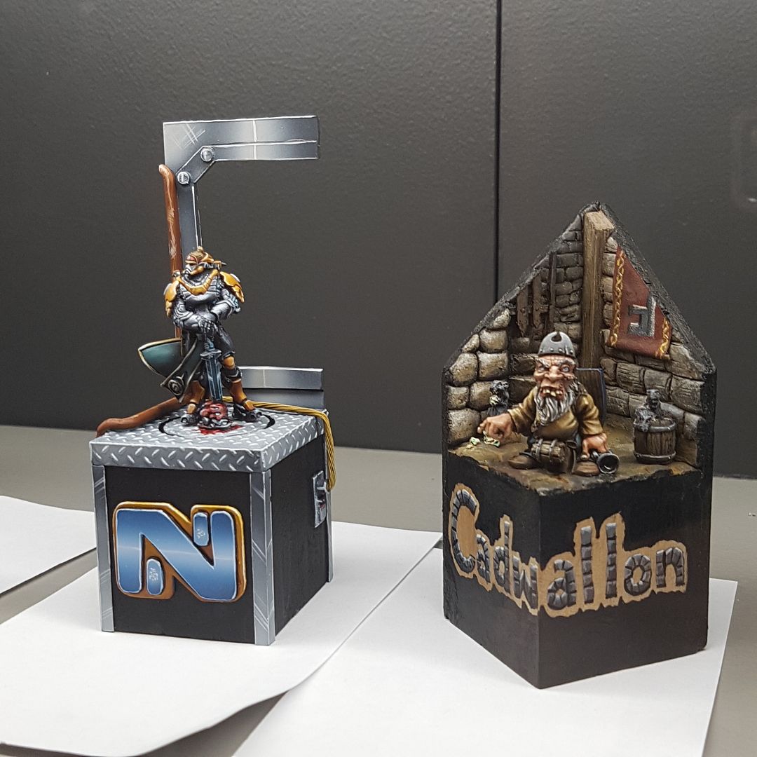
2. Cadwallon by Michael Stubbs - this simple approach to sculpting the background elements was refreshing and just really good! I liked that aspect very much and have filed it away in my memory.....


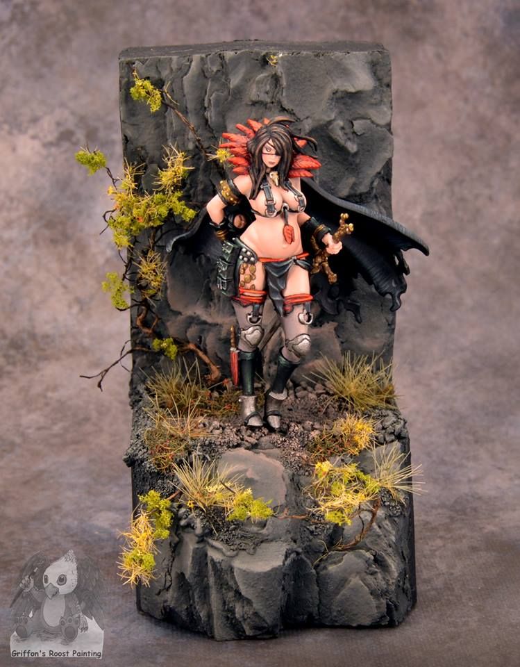
3. Lauren Fahey (Griffons Roost Painting) - Fade (Kingdom Death) This was a really lovely piece that had beautiful skin tones, solid composition (great use of the vegetation to move the eye around and an interesting way to break up the traditional plinth to create greater interest and movement) and some really great details throughout. Plus the artist was super nice.


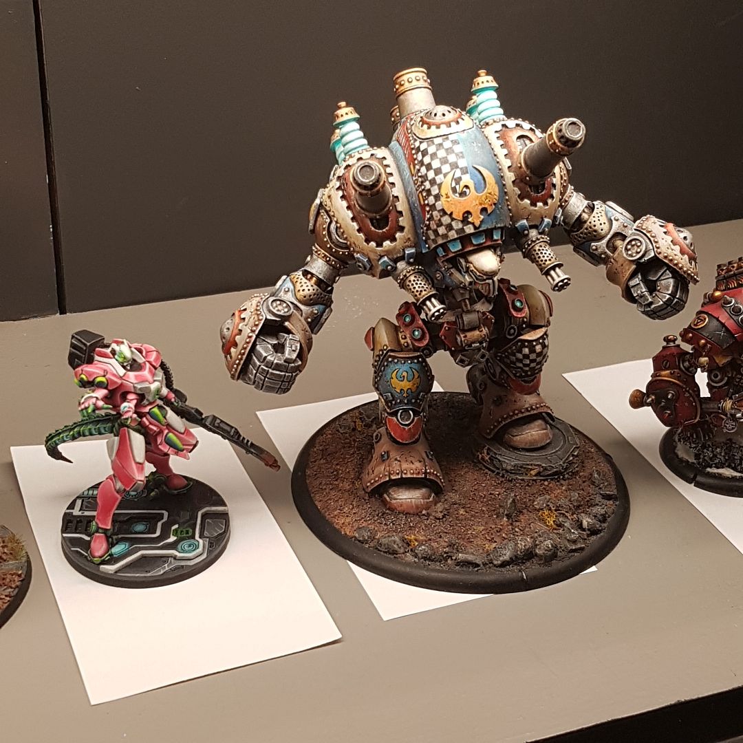
4. Cygnar Stormwall - While the finish on it was a dusty drybrushed type of surface that was difficult to take great photos of - the overall impression of this model was excellent. The colour combinations were really cool and the overall level of detail was really great.


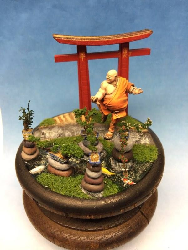
5. Monk - mini diorama by Michael Stubbs - Michael again on this list - not because I have known him for years or because I thoroughly enjoy his sense of humor, but rather because his understanding of the "rule of cool" always shines through in his work. He gave a great deal of thought to the overall presentation of this little vignette and the extra details - like the porcelain planters with individual blue glazework designs and the beautiful little koi - are simply cool. I really enjoyed seeing this.


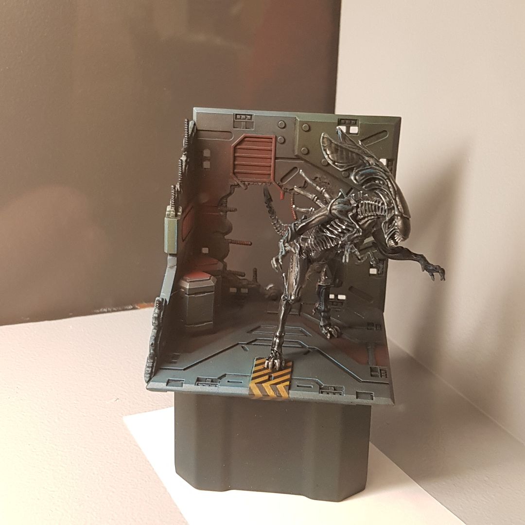
6. Alien Queen - a simple but incredibly effective piece with a HIGH "cool factor". The scene told a clear story and the whole thing was painted very clean. I desperately wish I had a better picture of this! If anyone out there does - I would love to replace this one as it does the little scene zero justice!


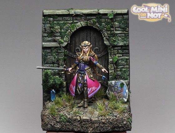
7. Zelda - I can save myself - by Seth Walker. Yeah this was up for voting too but i wanted to revisit it because I had a really fantastic critique and discussion with Seth about taking his work to the next level. This led to one of the best parts of the whole weekend for me where he found me a couple hours later in the hallway to show me a new WIP where he was applying the ideas we discussed. It was so clear that he understood and he was so excited that it was truly infectious happyness! I look forward to seeing what comes in the next year from him.....


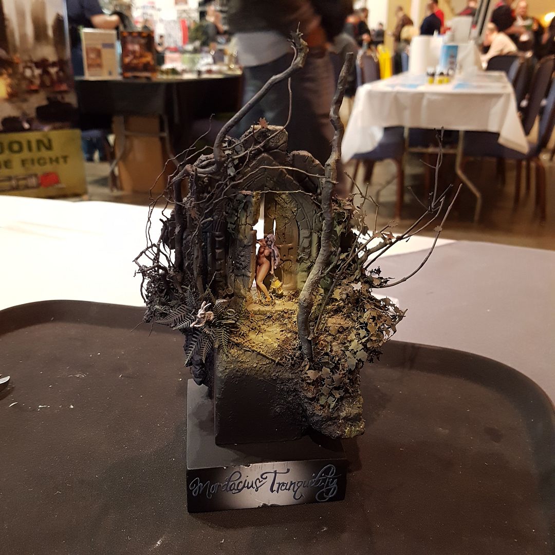
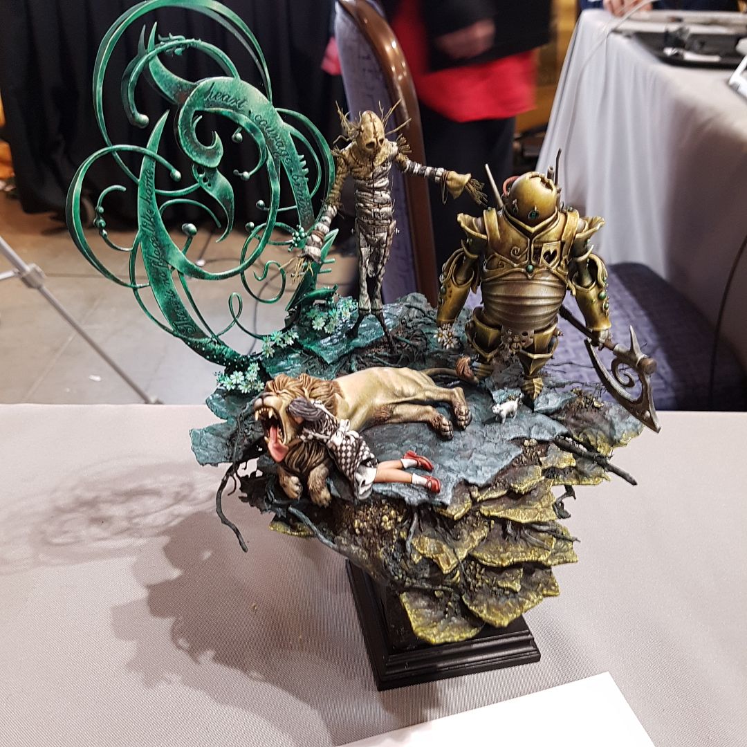
8. Mordacius Tranquility by Seth Amsden (a different Seth than above!) - the application of painting technique may have been a little oversimplified here but the overall impression was fantastic! I LOVED the composition, the way the natural elements framed the scene and the energy of the rabbit jumping forward - a Kingdom death meets Alice in Wonderland moment to be sure. the sense of dramatic lighting was clever and the whole thing was really really pleasing. Genuinely loved this piece.

Unfortunately there are a few that I really liked that I do not have proper phots of - including Russo's Darth Maul and Mecha entries - But with that being said I do have a few more nice shots to share so I will leave a link for a slide show of some of my shots from across the event here - hope you enjoy as much as I have!


(thats a lie.. you wont.... I enjoyed this too much for you to possibly feel the same... :P )
See you Next week!


Tuesday, December 06, 2016

Leather and Boots and Busts Oh My! (its not what you think....)


Working on some new SBS tutorials of my own to share with you all but it has been taking longer than I had hoped, so in the meantime I am posting links to a couple of amazing tutorials that I have come across on Planet Figure - partially to share with you and partially for me to keep track of later!

The first is an article on painting leather boots and other clothing by Grant Gellatly - I cant wait to try this myself - painter friends take note this is DEFINITELY WORTH reading.

http://www.planetfigure.com/pages/Painting-Leather-Boots/  


The Second is an older but exceptional SBS from my friend Fernando Ruiz. I love the sense of texture in the hat and the wonderful control in the skin.

http://www.planetfigure.com/pages/Painting-with-Acrylics-by-Fernando-Ruiz/


Till next week!


Tuesday, February 09, 2016

Boromir's Struggle Part 5 - Finished Pics

This project is a special one to me. It is the last model my mother and father bought for me before mom passed away, and it is one I know she was particularly proud of me for & impressed with. Mom was one of my biggest supporters and I am really glad this model happened and came together the way it did.

I painted this new (to me) size and format using virtually all new techniques - really stretching myself.  I painted it in a way that I knew might limit my success in the eyes of some judges, but I carried my personal vision through and am genuinely proud of myself.

I hope you have enjoyed the articles and that you find the product pleasing and/or interesting.
If you have any questions do not hesitate to ask.

I will be taking this one to several shows this year. Most recently it placed Silver at GenCon  and then after a little reworking (thanks to David Diamondstone in particular for his advice and critique) it placed Gold at the incredible Sword and Brush Competition in Toronto alongside works by other incredible artists like Mathieu Fontaine and Zeno Mladin.

 A final thanks to my good friend Trevor Howard for taking these shots :) Enjoy!


Tuesday, February 02, 2016

Boromir's Struggle - Part 4 - NEW Metallics, Shield, Hair & Leather

With the biggest scariest steps out of the way, my first bust (Knight Models Boromir) was really coming together - but there was still a great deal to do.
 I have long been an advocate for aiming to use different surface finishes and contrast of luster across a model (inspired by David Rodriquez and his slayer sword winning tyranids way back in 2007!) and while I was pleased with the effects and surfaces so far, I thought it was time to really push this with my metallic areas. I had actually acquired a new range of metallic paint for this project because I saw a sample of one golden tone that I felt filled a gap in the ones I already owned, and if you are going to order one paint, well it would be churlish not to try a couple more at the same time - helps make the shipping seem more reasonable right? ;P

Am I ever glad I did.

Dark Star Metals makes some of the most beautiful metallic paints I have ever worked with. They have exquisite colours - great coverage, superior lustre and they intermix like magic. When finished I gave them a quick polish with a soft cloth and wow do they shine like genuine metal. Just. So. Good. Find them on Facebook as Dark Star Miniatures or on their website.

 I used several of the paints and mixed them together in varying amounts. The results were these:


I also began to clean up the leather strap and painted it in a flat black (AMMO of Mig Jimenez   A.MIG-0033 Rubber and Tires) Mixed with a drop of P3 Coal Black. I then highlighted this in a textural way with additional coal black and some small amounts of ScaleColor Nacar (a warm grey/brown tone) working to make it look like a real worn/well used leather finish - again inspired by something that Fernando Ruiz of FER miniatures showed me last spring :) (Thanks Fernando!).

In between drying times I also started into the shield. I was inspired to try something though I'm not 100% sure why - perhaps I was just feeling brave seeing as how well everything else had gone and that it was just the shield - more easily stripped if it all went very poorly! I took three of my Scale 75 Scalecolour paints and began to layer them in random patterns with sponges and stippling with old brushes. The resulting pattern was an incredible texture and provided a beautiful warm base over which I glazed several filters of SC54 Navy Blue and a touch of P3 Coal Black. The result was very pleasing to me and I have received more compliments on how cool that part looks than maybe any other lol!


With the metal and leather taken care of and the shield in progress, I began to work in earnest on the hair and small details like the ropes - as well as fine tuning the colours in the face. On a sunny day I sat it on the rail of my deck and shot these pics.  


While it can be seen in the first one above, I think the one of the back does the best job of illustrating the break between the two sides of this bust and the transition of warm and cool tone.


I am really pleased that it is genuinely present in the figure - especially the face - without overwhelming the model and making it look like a strange OSL glow. I knew going into this piece that it could be a potentially confusing and polarizing choice for viewers, but I am still very pleased.

With a bit more cleanup and some painting of the fur trim around the bottom this paintjob could be called done...... But a great bust is not presented as paintjob alone. It requires something special to bring it head and shoulders above the competition (pun intended!). Boromir was going to require a great base - and I cant think of ANYONE who makes finer display bases than Wayne  Rogers of Waynes Bases.  In this case I had bought one from him several years ago not even sure as to what I would put on it - but it was so absolutely incredible I couldn't resist!


Ebony in the center with a laser engraved golden oak replica of the one ring surrounding it. This base was a work of art in and of itself. Here was a plinth that would add to the story element, the beauty and not just compliment but enhance the craftsmanship element of this presentation.

Thank you Wayne. You are the absolute pinnacle.

NEXT WEEK - The project completed with a GALLERY OF FINISHED PICTURES!!!!!

CYA

James K. Craig AKA TKKultist 

Monday, January 18, 2016

Boromir's Struggle Part 3 - Damask & Filters AKA the Scary Part.

Today we will continue with the log for painting my first ever Bust/large scale model - the awesome sculpt of Boromir by Knight Models.

SO this is more or less where we left off -

1. Colours blocked in with the airbrush

2. Preshading on the cloak, hair and face and face.

3. Skin tones made of brownsand, black red, pale flesh and a touch of ivory

4. Bluish tones added to skin tones on left side of face, hair and into left side of cloak.

5. Unmasked it as we are finished with the airbrush for now...


So what is next, and why do I refer to it as the scary part? Well that is because If I screwed up on the next segment I would have to strip the whole model and start again. Yep. All or nothing - and it wasn't going to be easy! But man, was it exciting :)

So I took a picture of Boromir and used the computer to recreate it in black and white with full transparency - this way I could lay it over a variety of patterns and get a rough idea of what each would look like and what scale I wanted to paint it at! I tried a LOT of different patterns before deciding on one. That being said, I honestly believe it was worth the effort and planning.


So with a rough plan and a pattern to work with I grabbed my newest paintbrush obsession - a 3/0 by Broken Toad (SO GOOD and HALF the price of Series 7 - Full review Soon!), my Vallejo White grey and with a combination of flow aid and unicorn tears started to paint this pattern. I would love to tell you there is some sort of trick or super slick technique to doing this.... but there isn't. This was good old fashioned time, sweat and swearing until it all came together! I kept it as clean as I could and really used the beautiful line control that the Broken toad brush allows for to lay it in. I did it in 2-3 layers so that I could sketch it super translucent first - removing and mistakes before the paint had time to bite in and then set it with a hairdryer as soon as I had a section I was pleased with. then I re-layered to give greater opacity and smoothness. eventually I worked all the way around the figure.


 This was good - the pattern looked great...... But now was the point where I had to hold my breath and hope for the best! I knew it was coming. I knew that I wanted to do this, BUT (like pretty much everything else in this project thus far) I was about to step into territory that I had not actually tried before. I was trusting in my skill and understanding of my techniques and tools to carry my through.
The next step was to paint completely over the top of all the damask, the shading, the transitions that I had created in that cloak. I was going to cover ALL of it with a burgundy filter.. When I did so I had to count on my contrasts and transitions to be strong enough, my filter to be translucent enough and my brushwork to be clean enough because once layered there was no going back. All in.


I used P3 Sanguine base, Model Air Maroon and some black red with a tiny bit of Badger Ghost tint blue in the left hand shadows..... And by golly it worked ;)


The pattern held, the shadows held, the transitions held. It was beautiful and I was so relieved.


Next up leather, new metallics, the shield, hair.... all the things!

James K. Craig AKA TKKultist


Tuesday, January 12, 2016

Boromir's Struggle Part 2 - Skin Tones


So with the Cool (mostly blue and violet) tones in place, as well as a general lighting scheme, it was time to start "fleshing out" the palette so to speak.  I reached not for standard "flesh coloured paints" as I normally do, but rather took a chance with a combination shown me by Fernando Ruiz of FER miniatures. He is an amazing artist, and maybe the most entertaining teacher I can remember having. I was Lucky to have the opportunity to do a workshop with him in the spring of 2015 hosted by Bent Bristle Miniatures. It was a really eye opening experience and gave me a lot of courage to push ahead!

The skin in mostly comprised of Vallejo Brown sand, Black Red and Light flesh. I used my Badger Sotar airbrush and sprayed a variety of mixtures and layers of these three colours. The results were REALLY satisfying. I would later add a little bit of Reaper Rosy Shadow and some thin glazes of additional colours (mostly the brown sand and black red mixed with Fernando's "Unicorn
tears" drying retarder) to warm the palette a little more in a very controlled way.

Anonymous by Banshee. So. Damn. Cool.
The left side of Boromir's face was where I had to make some hard decisions. I knew that what I wanted to do was to use a method, similar to that of LOTR director Peter Jackson, to suggest the corrupting influence power of the one ring. In the film Jackson often uses a cooler palette and a blue filter when the ring is being used or influencing the actions of the fellowship.  To do so on a model, however, might suggest to a viewer a strange lighting effect or desire to artificially push blue Object Source Lighting (OSL) - which I didn't want to happen. (This effect can be really amazing - I think to some of the works by Banshee as an example - but it just isn't what I wanted here....)
So I looked around at some artists and images that I felt used this kind of filter successfully and went for it anyway. Bottom line - I wanted the effect no matter what. Even if judges may have not taken it the intended way, I knew what I wanted for me and I was not going to step back from it now!

Here are a couple of the inspirational colour references I used:


A painting by the legendary Frank Frazetta and a great image from an advertisement for the show Vikings. Both of these use light and colour in really interesting ways (I someday hope to sculpt and/or paint Ragnar piece as a bust or model using this scheme! I am considering doing the one by sculptor Juan M Puerta from Scale 75...have to wait until I can afford it though and, in all honesty I am hoping nuts planet will do a bust to match the shield maiden first ;P ).  So, to play up the warm cool contrast and to add even more filtering of blue in the left side of  the face I used the initial blue shading I showed in the previous post and added some more sprayed in filters using Badger Ghost tints and some VGC Blues amongst the layers of flesh tones. I included less of the yellowish sand colour in this side of the face as well.

 I also added some of these same filters into the shadows on the left side of the cloak and into the hair. In the end I was pretty satisfied overall!


It really is amazing how you can make such fantastic skin tones with different colours - I really recommend anyone who is looking to push their skill sets ahead to start experimenting and learning about this concept! Later I would push and pull these values more dramatically with my paintbrush but for now I felt REALLY good about the direction it was taking. The sketch was now done - it was time to add detail.

Next we tackle the scariest part of the whole process - the complex damask pattern and colour filters for the clothing  :P

Cya Soon
James K. Craig AKA TKKultist

Tuesday, January 05, 2016

Boromir's Struggle Part 1

So WAAAAY back in January 2015 I laid out the things I wanted to accomplish this year and foremost among those was to complete a bust of Boromir by Knight Models for GenCon. I wrote:

A couple years ago I started to prepare my own sculpted bust of Boromir, but when I saw this one I stopped - there was little point as this one is so good. Boromir has always been my favorite character from LOTR and having Sharpe's Sean Bean play him in the films was a fantastically cool choice. I would like to finish this for the large category in the GenCon painting competition. I have the plinth already (made several years ago by Wayne of Wayne's Bases for the first planned bust) and I am thinking about trying for a paint job that plays on the duality of Boromir's character - having one side of the face warmer and the other side cooler suggesting the influence of the ring working upon him. A little ambitious for a first try? Perhaps - but I have everything to gain in the experience and nothing to lose but my own mind!

Well, I did it. 

And I'm Darn proud of the results  - but I'm getting a little ahead of myself. Lets talk about the kit itself first and show you how I painted it before skipping right to the reveal ;). This will probably take a couple posts so lets get to it!

So the kit comes in a really nice looking little box, which I feel is just slightly too small for the contents. The box was literally bulging when it arrived in the post. This aside my cast was luckily whole and unbroken and on first blush was pretty clean. The cleanup was for the most part as expected - wash, some small mold lines to file/sand (wear a mask it is resin!) and a couple little bubbles to fill. If it wasn't for competition I could probably have overlooked a bit of this, but I took my time - watered down some apoxie sculpt and broke out the 600 and 1200 grit to make sure it was right. Took only one evening to clean, that's pretty great.

The sculpt is beautiful - looks very much like Sean Bean and has some really nice combinations of fine sculptural detailing and broad smooth surfaces. I really like the way the hair flows and the texture of it as well. Wasn't 100% sold on the sculpted ropes - but not enough to redo them. As much as I can be critical - I was (and am) genuinely over the moon pleased with this piece!

Once prepped I hit it with both black and a light grey primer (Ammo of Mig) to establish a sense of light and volume. I then got out VGC Night Blue and began to establish some cool tones in my shadows. I then added  VMC Intermediate Blue to the mix - this softens the colour in the fabric somewhat. I also used Golden Brand Dioxanine Purple to basecoat the cape (fabulous paint SUPER pigmented - but a little harder to clean from the airbrush!). 

I still left a lot of light showing in the ripples of the fabric  as this undercoat is really to set tone rather than fully paint. I also sprayed in a small amount of badger FreakFlex transparent blue - basically the same as the more well known "ghost tints" this is a translucent film which can tint colours without adding great opacity.

With that in place, I masked off the sprayed areas with blu- tack and saran wrap and grabbed my VMA Camo black brown (as my readers know this my "go to" for a warm dark colour) and again began to lay out a sense of volume in the hair as well as using it to preshade the deepest areas.

I really want to pick up some of the black masking putty I have seen some other painters use - if you are a painter who has tried it - do leave a comment and let me know what you thought (if you are the manufacturer and want to send me some to review I wont argue with you either lol!) 

Seriously though I think I will definitely need to pick something like this up for future projects!

Well I think this is a good start and my wife is starting to wonder if I plan on making it up to bed tonight so I think I will log off and continue next time with the most interesting and complicated part - painting skin and a full on damask pattern!! Cya in a week (ooooh cliff hanger!)